To add a use case to a model, you first need to navigate to the package into which the use case will be added. Use cases are organised into families within use case packages. Using the tree view control at the left of the main window, expand the list of use case package names, and then click the package name into which you wish to add your new use case. If we were going to add a new use case to the 'Ticketing' package in the example below, we would end up with the user interface looking like this:

To add a new use case into this package, select Edit | Add Use Case from the main menu, or click the toolbar button for adding a use case as shown in the screenshot below:

A new use case will be created in the selected package, with a unique name in the form UsecaseN​ where N is a number used to make the use case name unique. The right panel of the main window changes to become the editing panel for the new use case's details.

To view the details of a use case, you will need to expand the tree view at the left of the main window so that it shows you the list of packages in the model. To do this, click on the '+' next to the 'Use-case packages' node in the tree view.

Once you have done this, click the '+' next to the package name beneath which the use case you seek is located. This will expand the tree view to show the list of use cases in that package.

Finally, you can click on the name of the use case you wish to view. A screenshot following selection of the use case 'Top Up Card' in the package 'Ticketing' is shown below:

To edit a use case, navigate to it as described in Viewing Use Cases above. The right panel will be populated with the details of the selected use case. In this panel, you can edit the following fields:

Use case name

You can change the name of the use case, so long as the name you change it to is unique across the whole model. Note that changing the name here will change all references to it from other parts of the model.

Extension

This use case might be an extension of another use case. The 'Extends' drop-down lists the names of other use cases that this use case might be an extension of. You can select which use case you want to extend here, or you can select the option (none) from the drop-down that makes this use case a standalone use case in its own right. This is the default for new use cases.

Preconditions

If there are preconditions that must be true before this use case is allowed to run, these can be described in the 'Use case preconditions' section.

Primary path description

A high-level description of the sequence of interactions between the actor(s) and the system being modelled would be given here. This description should only explain the expected most common sequence of interactions that reaches the use case goal successfully. This is commonly known as the primary or 'happy' path through the use case. Alternative paths will be described elsewhere.

Success guarantees

A brief synopsis of any testable outcomes that should have become true after the use case reaches its goal successfully can be given at 'Use case postconditions - success guarantees'.

Minimal guarantees

testable outcomes that should be true on completion of the use case, regardless of whether the goal was achieved or not, can be given at 'Use case postconditions - minimal guarantees'.

Note that there is no 'Save' button on the data entry panel. Navigating away from one text input box to another control on the panel causes an implicit saving of the data from the field just left.

A screenshot of a partly edited use case appears below:

Associated actors

It is possible to identify which actors participate in a use case, as well as which actor is the primary or originating actor for a use case.

To do this, select the use case that needs actors in the tree view at the left of the main window, then from the main menu select Edit | Edit Use Case Actors. Alternatively you can click the toolbar button highlighted with a red arrow in the screenshot below:

The dialog box that appears has a check box list at the left hand side from which you can select all the actors that participate in this use case. The drop down list at the right allows you to select which actor is the initiating actor for the use case, this being the actor that wants the use case goal to be reached.

To delete a use case from the model, first navigate to the use case to be deleted as described in Viewing Use Cases above. Once the use case to be deleted has been selected as if for editing, click Edit | Delete Use Case from the main menu, or click the toolbar button that serves the same purpose, as shown in the screenshot below:

A dialog box will appear asking if you are sure. This is because your use case may be referenced by other parts of the model, so the tool is giving you an opportunity to change your mind.

In some circumstances the tool will refuse to let you delete a use case because the deletion would have an unresolvable outcome on the model. Examples of this are when the use case is a parent of an extension relationship, or a child of an include relationship. Suitable dialog boxes will appear to explain the problem. You should break these relationships first if you still wish to delete the use case.

Viewing use case diagrams

Once a few use cases have been added to a package, it is possible to view and adjust the layout of the use case diagram for that package.

Select the package whose diagram you would like to see from the tree view at the left of the main window, then in the right panel, select the 'Use case diagram' tab at the top of the panel. The use case diagram will be displayed in the panel:

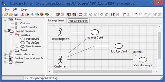
The use case diagrams are autogenerated from the textual input of the model descriptions. This tool deliberately does not let you add items to diagrams and then set their descriptive properties afterwards. By making you enter the descriptions, and then autogenerating the diagrams, the tool guarantees that the diagrams match the descriptive text, and that you actually enter some descriptive text rather than just generate diagrams with no context!

Manipulating use case diagrams

Although the content of the diagrams can only be set by editing the model descriptions, the layout can be adjusted from within the diagram pane.

If you click on an actor or a use case symbol, the corresponding item changes colour to red to indicate it has been selected. The item can now be dragged to a different location on the screen. Any connectors that link to the dragged item will be adjusted so that they remain connected to the dragged item.

If you double-click an actor or a use case, the Use Case Editor will jump to the editing page for the corresponding actor or use case descriptions.

It is possible to reroute the connectors between items. If you click on a connection, the connection line will become red to indicate it has been selected. You may now right click on the connector and a pop-up menu will appear:

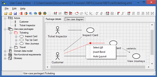
Note that if the right mouse button is clicked on a corner selection grip (the red rectangle at the bend in the connector), the 'Insert bend' menu item is replaced with 'Remove bend'. Select all will highlight the whole diagram in red, allowing you to drag everything on the page. Insert bend will allow you to introduce new bends to the connector so that it can be routed around obstacles on the diagram. Auto Layout lets the Use Case Editor automatically layout the diagram using an internal default algorithm. Note if you select this, any manual layouts you made will be lost. There is no 'undo' for this layout window!

Note too that once a connector has been highlighted, the line itself may be dragged, or by dragging the rectangular grips you can relocate the ends of each line segment. Experiment with dragging connectors, and with inserting or removing bends to familiarise yourself with the layout tools.
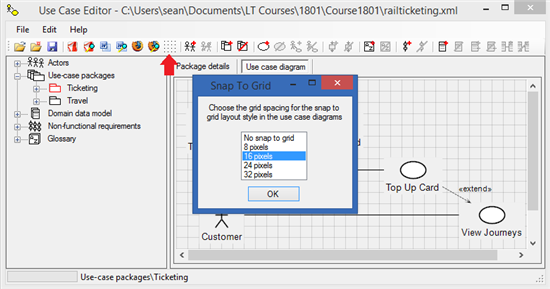
Snap to grid

By default the layout tool snaps graphical elements to a grid that has 16 pixel resolution. This makes it easy to keep lines horizontal and vertical, as well as helps to align actors and use case symbols. The grid resolution can be changed to 8, 16, 24, or 32 pixel resolution as well as being switched off altogether. To change the grid resolution select Edit | Grid spacing ... from the main menu, or click the corresponding toolbar button as shown in the screenshot below: